


Some of my favourite novellas
My mini-series for the time-poor/ short attn-spanned continues. Also: an interview with Esther Perel and a must-read for anyone filled with self-loathing

Presenting part 2b of my mini-series on novellas. (Part 1 was on short story collections and part 2a) was on mini works of non-fiction.) Some people count a novella (a short novel) as anything up to 250 pages, I’ve focused more on the 100-150 pages.
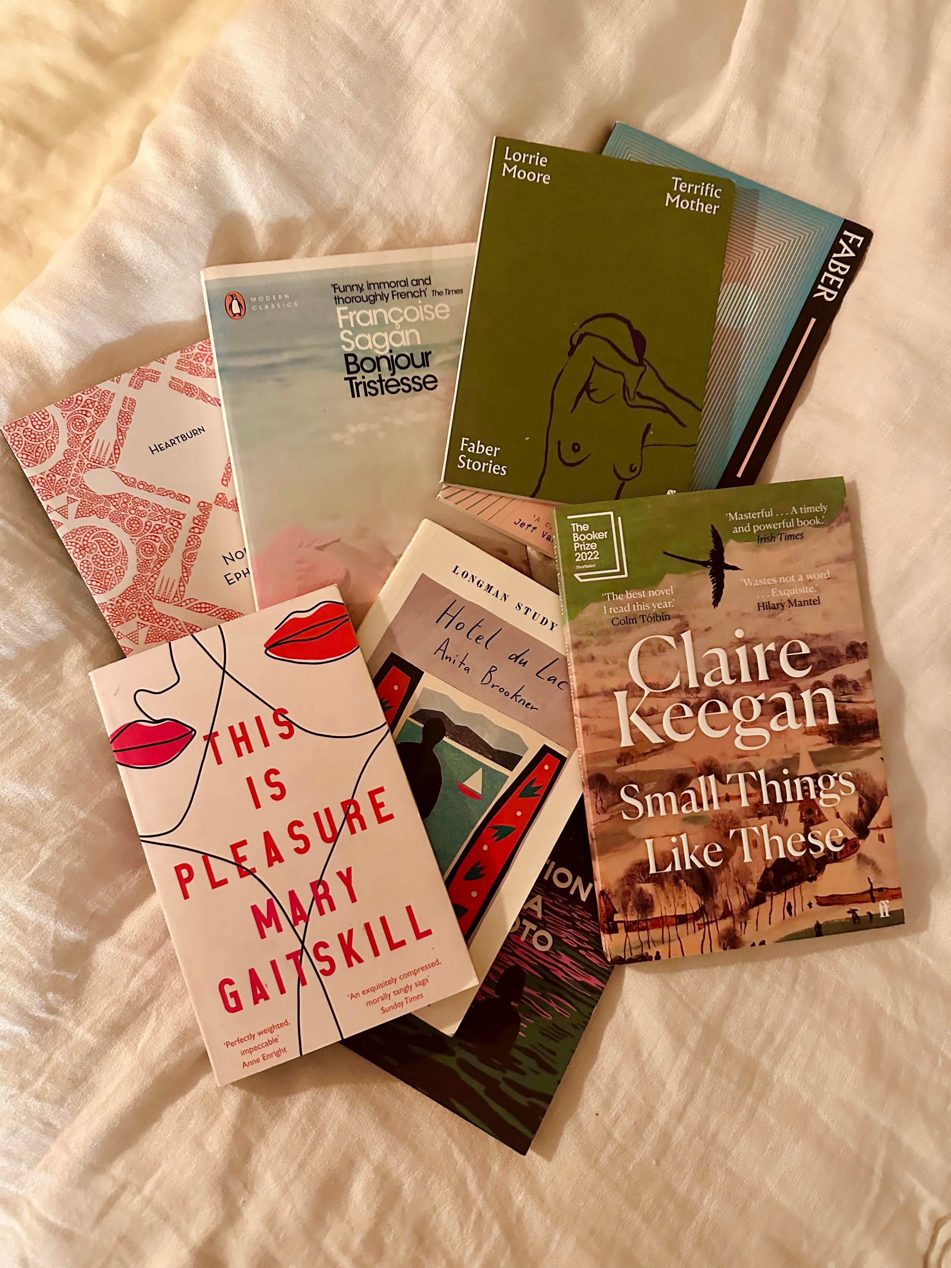
This Is Pleasure A skilful, absorbing novella by Mary Gaitskill about Margot grappling with the news that her friend Quin, a fellow book editor, has been accused of multiple acts of sexual assault. The chapters, which are usually only a couple of pages each, alternate between M and Q, so you have this sort of narrative tussle between these friends of over 20 years. Margot has always been ambivalent about Quin’s behaviour (she refers to the stories as “awful/ funny”; enjoys his “rakishness”, his “dirtiness”) while Quin has always viewed himself as a “sensualist” and still, now, remains charmed by himself (he assumes these women will shuck off their victimhood soon enough and move on to something else). Margot can’t decide if she should turn her back on Quin - “this is where I don’t understand my own feelings” she admits - or if she even wants to. And what if she doesn’t? Is she as bad as him? A thought-provoking, nuanced book.
The Great Gatsby Bet you’ve never heard of this one! But this book by F. Scott Fitzgerald is so short, I like to re-read it fairly regularly (I find it very different to the film.) Set in the roaring twenties, Nick Carraway is writing from a sanatorium about his past friendship with a millionaire Jay Gatsby and his erstwhile lover, Daisy Buchanan. Sometimes I find this book a bit overrated (please feel free to fight me in the comments, I welcome a fiery defence of it), at other times I think it skewers greed, celebrity and the American Dream perfectly. (This is a great piece on why Gatsby’s time is now.)
Heartburn How could I not. Nora Ephron’s 1983 book has gone through something of a revival for millennials and will no doubt have another revival on BookTok. It’s a piece of fiction (I’d call it auto-fiction) inspired by Ephron’s own life, when her husband Carl Bernstein left her 7 months pregnant and with a toddler, told through Rachel, a cookery writer and Mark, a dolt. It’s a gorgeous book - tender, waspishly witty, full of grit and pin-sharp observations - but I feel incredibly rageful when I read this book tbh. Thankfully Ephron got her revenge by publishing it, against Bernstein’s will. If you haven’t read it, here’s a small excerpt of a bit that particularly tickles me, to whet your appetite:
“And then Mark started to cry. Mark started to cry. I couldn’t believe it. it seemed to me that if anyone was entitled to cry in this scene, it was going to be me; but the man had run off with my part. “I’m in a lot of pain”, he said.
There has been a lot written in recent years about the fact that men don’t cry enough… I would like to say two things about this. The first is that I have always believed that crying is a highly overrated activity: women do entirely too much of it, and the last thing we ought to want is for it to become a universal excess. The second thing I want to say is this: beware of men who cry. It’s true that men who cry are sensitive to and in touch with feelings, but the only feelings they tend to be sensitive to and in touch with are their own.”
Small Things Like These This is such a lyrical and profound little book by Claire Keegan, set in 1985 featuring father of five and coal and timber merchant, Bill Furlong, who is busy dropping off his goods ahead of Christmas. As he makes his daily deliveries he becomes increasingly concerned about a young girl in one of the Magdalene Laundries (church-run, state-sanctioned institutions in Ireland where “fallen women” and their children were kept in appalling conditions. It is estimated that 6,000 babies died in them and the last laundry, shockingly, was not closed down until 1996.) Furlong is used to keeping his head down - like everyone he knows does, like his wife advises - but he can’t just sit down with the papers and a pint on his one day off. He must put his head above the parapet. I’ve seen Small Things described as Dickensian, and I’d totally agree - Furlong is heroic, (or he puts it, “of foolish heart”) and this book is loving and hopeful.
Convenience Store Woman I’ve written about it a few times this year, but this is the most famous of Sayaka Murata’s 11 novels - though by no means the weirdest, I’m still haunted by Earthlings - about a convenience store worker called Keiko resisting Japanese society’s pressure to get married and have children. The only thing she wants to do is be in her beloved convenience store. It’s a quirky and charming story and very easy to read.
Terrific Mother My favourite of Lorrie Moore’s writing, this little story has been taken from the story collection, Birds of America and published by Faber in teeny tiny stand-alone clutch-bag size, costing £3.50, which I remember books actually used to cost 30 years ago. It’s about Adrienne who doesn’t want children but finds them always thrust into her arms anyway - and then one day there’s a terrible accident and she kills a baby. She goes into hiding for 7 months, but she’s lured out by a man who wants to be her husband and who takes her to an artist’s colony, where she is torn between allowing herself to live again, with the help of a philosophical masseuse named Ilke, and keeping herself locked inside a cage of guilt and shame and trauma. It’s very funny in parts and achingly lovely in others. Says Ilke of why people come to her for massages:
“It is because they are overeducated and can no longer converse with their own mothers. They have literally lost their mother tongue. So they come to me. I am their mother, and they don’t have to speak at all.”
Bonjour Tristesse If you didn’t read this as a tormented teenager, where were you? The Guardian once called Françoise Sagan “the French Scott Fitzgerald” and it’s true that Tristesse, published when she was just 18 (!) in 1954 has become a cult book. It tells the story of moody, nonchalant Cécile, who enjoys the sole attention of her widowed father - until his girlfriend, Anne, only a little older than Cécile, joins them on their summer holiday on the Riviera.
I re-read this a couple of years ago for an episode of BBC Radio 4’s A Good Read (I shiver thinking about that day, as I’d had just one hours sleep the night before and I remember the studio literally shimmering before my eyes.) The book thrums with authenticity - Sagan was 17 when she wrote it, Cécile is 17 - and teenage imperiousness: “I noticed that [Anne] was lightly but immaculately made-up. It seemed she never allowed herself to be really on holiday” but it’s also so sage and elegant about matters of the heart. It’s really astounding that she wrote it as a teenager.
Other novellas I have on my bedside to read:
Hotel du Lac by Anita Brookner
Termush by Jeff VanderMeer
The Premonition by Banana Yoshimoto
BITS
I enjoyed being interviewed for Cup of Jo’s Big Salad newsletter about my favourite indie/ vintage gifts for Xmas. I love recommending gift ideas - I’m planning a huge round-up for all price-points in The List soon.
Aaaaand if you’re a paid sub, don’t forget to check out this Book Thoughts on Still Born by Guadalupe Nettel, translated from Spanish by Rosalind Harvey. I’m still thinking about it.
I interviewed my OG podwife Dolly* at the stunning Usher Hall in Edinburgh last night about her new novel, Good Material. It’s narrated by Andy, a comedian in his mid-30s who is heart-broken after his girlfriend of almost 4 years, Jen, dumps him. Jen embraces her freedom while a bitter and furious Andy “reeks of monogamy”. It’s a modern update of High Fidelity, with a Fleishman-style narrative-swap at the end (which I adore) and it’s about love and heartbreak, obvs, but it’s also about family, friendship, ageing and ambition and it’s incredibly funny and touching. Also, I love this city so much! I’m typing this from a cafe called Tani Modi and wish I could stay longer.

I loved this piece by Elif Shafak on the recently deceased Possession author and essayist AS Byatt in The Times last week which says so much about curiosity and writing. This paragraph feels particularly salient right now:
“We live in an age where we have too much information, but too little knowledge and even less wisdom. Every day we are bombarded by snippets of information and the truth is we cannot process them. So we run, and we consume everything fast. But information is very different than knowledge, and wisdom is something else altogether. Byatt sincerely cared about knowledge and she knew that it could neither be rushed nor delayed.”

image source: The Times
Cystic fibrosis sufferer Sarah Meredith was told that the average wait for a new liver was 68 days. (There aren’t enough livers in the UK for the 700 people on the transplant list.) When 21 months later she was still waiting, her mother Jess looked into how organs are allocated on the NHS. What she found, was that the decision was not made not by a board of doctors, but an algorithm which gives every patient a Transplant Benefit Score to dictate where they will sit on the list. But what gives you a good TBS score? And what about the algorithmic biases? As Sarah got sicker, Jess found a tool with major design flaws. This piece by Madhumita Murgia for The FT is fascinating and terrifying in equal measure.
This is a particularly bracing edition of Ask Polly - the cult advice column by Heather Havrilesky that used to be at New York Magazine, also known as The Cut (why?) and is now on Substack - that I think would help a lot of people struggling with shame and self-loathing. To a reader who writes [this is a small excerpt]: “I can never make myself feel grateful and satisfied for all that I have. People would kill to have my life. But I always want different, always want to run away from myself and everything around me” Heather commands:
“You forgive yourself for who you are. You forgive yourself for every choice you’ve made. You forgive yourself for feeling ungrateful, which is natural and normal for someone who’s been abused. You forgive yourself for not having been magically rendered happy by money and marriage and a move to another country, knowing that these things don’t deliver instant joy the way they’re supposed to, no matter what our broken culture tells us”.
The whole - long - reply is a must read. Fierce and generous and galvanising.
Another goddess to seek wisdom from is the world’s most famous living psychotherapist Esther Perel (aka “the cheater apologist” to her detractors). I must confess, I have only listened to one episode of her therapy podcast as it felt too intimate for me (that’s the point tbf) but I hard recc her 2006 book Mating in Captivity for anyone in a long-term relationship and I loved what she had to say in this Sunday Times interview about how a fiction-free, on-demand world impacts our relationships (“you become less adept at dealing with the idiosyncrasies and the consistencies of other human beings”), the evolution of the way we love (“when you work with couples and families, you see social change unfold in front of you over decades”) and her new course, ‘Turning Conflict into Connection’.
Portrait by Vanity Fair
“What’s happening at this moment is that people are easily cutting off friends, siblings, family members with whom they have a divergence of opinion… They don’t know how to stay connected to somebody who may view the world different from themselves.”
In a society where people are encouraged to stay in their tribes more than ever (Vexed is a great book on that btw) this course sounds tempting. Unrelated sidenote: I am fascinated by her revelation that she does not think spontaneous sex is a good thing because “committed sex is intentional sex”. I would so have thought that Esther Perel would be pro spontaneous boning!
Further reading: this Vanity Fair profile from the summer on how “Tiktokkified psychobabble” is making us lonelier. (For a delicious snack, say ‘tiktokkified’ aloud.)
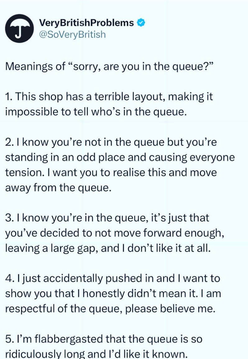
The love/hate relationship that British people have with queues provides endless content. And thus, I very much enjoyed the below.
Excitement this week over the new edition of Nicky Haslam tea towels, where the septuagenarian aristo-adjacent interior designer lists all the things that he finds ‘common’. Some people - understandably - dislike his raging snobbery, but I see the Nicky Haslam Common List less about common in the class sense and more common in the quantity sense EG everyone is doing it and therefore it has become basic/ middle of the road. Sometimes the entries are plain insane and therefore funny, such as a past one: “loving your parents”. Favourites from edition 5 include: podcasts, aperol and driving (presumably someone else driving you is fine). Edition 6 will 100% include newsletters. He just hasn’t heard of them yet.

I had never heard of fractals (endlessly self repeating patterns, often found in nature) before I read Emma Dabiri’s new book, and now I can’t stop puzzling over them. I still don’t really understand the mathematical element of them, but I’m a very symmetrical person - anything wonky or imbalanced makes me feel wonky and imbalanced - so I find them very pleasing to look at.

fractal pattern of romanesco-broccoli - pic c/o Wired
I love this map in the back-end (simmer down) of Substack, which shows the 162 countries that Books+Bits is read in. I can’t even name 162 countries! Looks like I need to get myself some readers in Greenland. (Is that Greenland? It looks…huge.)

*I recently read that this newsletter is only 39% British readership, so for anyone new to my work: The High Low was an iTunes No.1 pop-culture and news podcast that Dolly and I co-hosted for 4 years :)
Greenland looks huge because of the map projection Substack has chosen (it’s impossible to represent the map of the world in 2D keeping both the shapes of the countries the same and the areas consistent). To reassure you, in real life, the continent of Africa is 14 times larger than Greenland, which the map does not show! There’s a serious point here, which is that the popularity of this map has given countries nearer the poles like the UK an inflated sense of their own size (and hence importance) relative to countries nearer the equator (many of which we would have termed “developing”). Google “Problems with the Mercator Projection” if you’re interested and want to know more 🙂
I loved Claire Keegan's Foster (another of her novellas). I think it's genius to be able to evoke such a strong sense of place and community with so few words. I must check out Small Things Like These.